Every morning, we compile the links of the day and dump them here… highlighting the big storyline. Because there’s nothing quite as satisfying as a good morning dump.
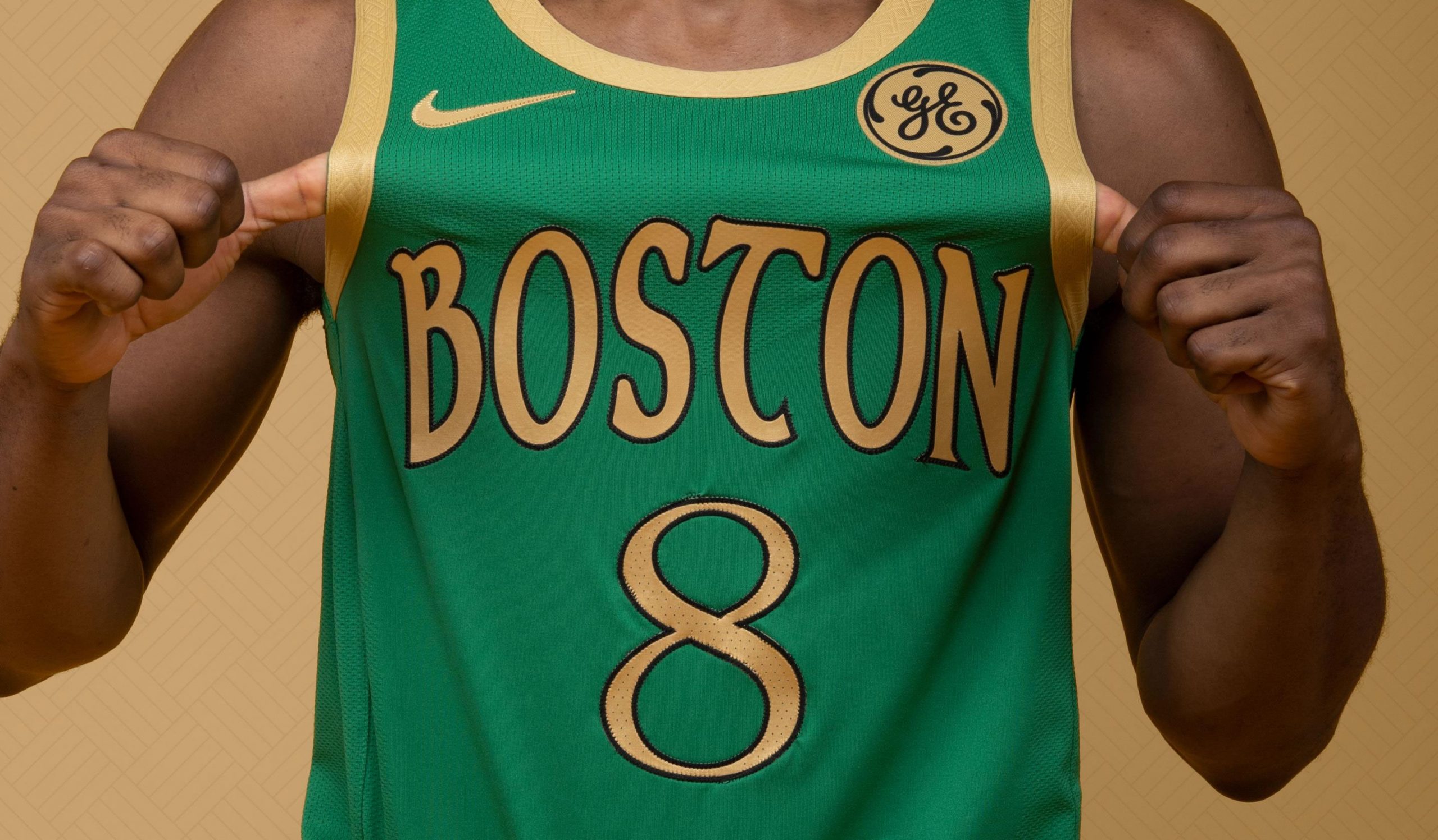
The Boston Celtics have unveiled their new city edition uniforms. Here is a description according to the team’s official press release.
“Paying tribute to the city’s rich history, Boston’s City Edition uniform features a solid green base with gold coloring projected on the Boston wordmark, number, and taping – a color scheme reminiscent of the team’s 2006 St. Patrick’s Day uniform. New to the Celtics uniform collection, the Boston wordmark features a unique Celtic font. Additionally, a Celtic knot is displayed on the gold belt buckle, serving as a representation of loyalty and love between the franchise and its passionate fanbase.”
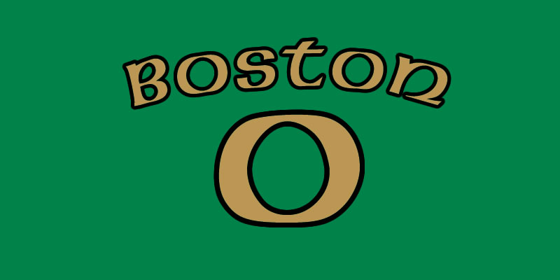
“The Boston wordmark features a unique Celtic font”
It’s a slow news day, and since my dad, a regular reader, paid for my degree in art, I’m going to put it to use. See, pop! I told you it would come in handy some day.
That is a ‘unique Celtic font’ in about the same way that Taco Bell’s Doritos Taco is ‘unique Mexican cuisine.’
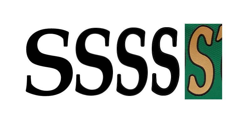
For starters, they stole the ‘S’ from Palatino, a font designed by the brilliant Hermann Zapf:
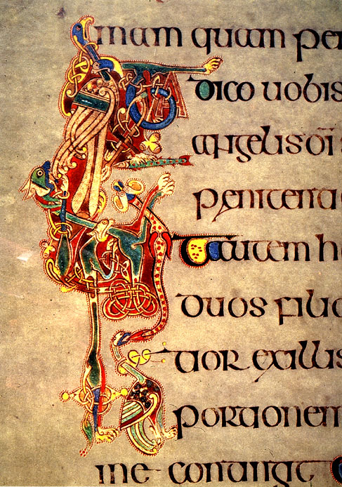 According to the press release, the font is supposed to resemble the uncial script that Celtic monks did, indeed use, but in reality those fonts were what is called ‘high contrast’ fonts, in that there was a significant difference between the heavy (wide) and light (narrow) strokes.
This embroidered doodle has minimal contrast with some of the letters, while other letters (and some–but not all–of the numbers) have no contrast at all.
And then there’s the scattershot use of serifs.
Uncial letters didn’t have conventional serifs—serifs are a peculiar relic of Latin monumental inscriptions, and they were not used in printing until some time after the invention of movable type.
The designer of this particular font seems to be aware of that fact, because most of the serifs are rounded exaggerations of the initial/terminal marks that calligraphers often left behind when they started or completed a stroke.
But there at the foot of the T and the N are pointy serifs that belong in a Roman font.
“Boston” is a six letter word, and within those six letters, our designer has managed to cram about four different typographical legacies, which is all the more impressive since it seems to have been done entirely by accident.
Now, what’s the point of all this?
Well, partially, because it’s my job to write a post on Friday and there’s not a lot of news today.
But it’s also because you don’t like that script. I know you don’t. At best you’re indifferent to it.
Yet, if asked why you don’t like it, you’d be hard pressed to say exactly what it is that bugs you about it.
I’m explaining, or more correctly, over-explaining why it looks ‘off’. We’ve been writing stuff for thousands of years. By now, we’ve figured out what works, and throwing serif, sans-serif and uncial scripts into a blender and putting the result on a jersey that costs $110 is just sloppy.
Want to pay tribute to the alleged ‘working man’ roots of Boston, or the city’s Irish heritage?
Here are few dashed together alternatives—the result of less than an hour’s effort by someone who is not a graphic designer by trade:
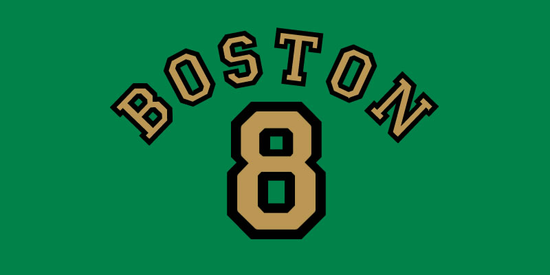
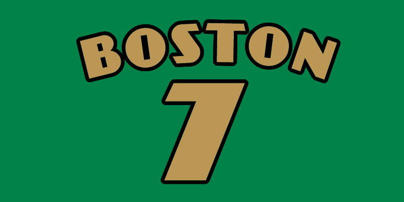
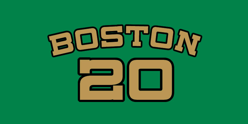
Three ‘blue collar’ designs and one ‘unique Celtic font’.
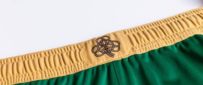
I will say this, though. The knot pattern that combines a Celtic knot with a ring and a shamrock is fantastic. And, quite honestly, they’re burying it by reducing it to a patch on a “belt buckle.”
Add The Sports Daily to your Google News Feed!